Thursday, February 10, 2011

When Strange Things Happen to Normal Rooms

Recently a space was featured on The Decorista that made me think.

I know! These are the things that keep me up at night...

Anyway she was charmed by this home because of its quirky personality and use of color. Two decor perspectives that we wholeheartedly embrace.

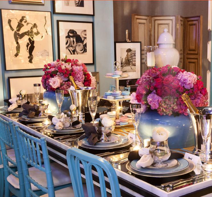
Whether it's to our liking or not, we can't dispute the quality of a well thought out space that expresses the owner's unique style. This image displays a fun, youthful and somewhat irreverent arrangement that works.


But while I find THIS image just as aesthetically pleasing (if not more so) for its use of color and textiles, it simultaneously perplexes me:


At first glance, it's fine. But upon closer inspection, there are two elements that are kind of bizarre. First - the low chairs that are paired with that table.

They're like beach chairs and convey a sense of casual comfort. But what happens when you decide to take a seat? Do you have a beverage in hand? Where do you put it in between sips? On the table which now offers a surface area at eye level? I'd probably just use the floor. So why bother with the table?

Well the answer to that seems obvious. It's less of a table than a pedestal employed to display a large ceramic zebra.

That zebra has been haunting my dreams.

In all fairness, the table also features a lamp and what appears to be a stack of decorative books. But the zebra is the real star of this stage. The proportions are just wacky.

I'm all for fun accessories and art. But when it comes to ceramic wildlife, a good rule of thumb is to keep the percentage of surface area used at less than a quarter. Otherwise, the animal takes on a somewhat larger than life quality. And you never want an accessory to look like it could leap off a table and canter down the hallway.

So as appealing as this cozy corner may initially appear, it has some serious problems when it comes to functionality.

Sometimes designers can get so caught up in concepts and whimsy that they forget about the people using the space and their potential preference for not looking up a ceramic zebra's nostrils while retrieving a cocktail positioned somewhere behind their left ear.

A cautionary tale indeed.


Wednesday, February 9, 2011

Star Quality

New to the shop: these great star mirrors.


A less ornate alternative to those starburst mirrors that don't seem to be going out of style anytime soon...(seriously are they really that fabulous? Ah - another topic for another post...)

We often forget to mention it - but everything in the shop can be shipped. If you see something of interest, e-mail us (stylekeywest at bellsouth dot net) for pricing information!

Monday, February 7, 2011

Friday, February 4, 2011

Iron Suzani

This week, our blogger/photographer friend, Robin from Around the Island posted this beautiful image:


It's the back gate of the chapel on the Mount of the Beatitudes, but our first thought when we saw it was SUZANI.

While it's not a new popular decor trend, the use of Suzani textiles seems to be a lasting one.


They appeal to both minimalists looking for a punch of pattern and color to add to their otherwise spartan spaces...as well as to full-on bohemian enthusiasts who require at least eight exotic print pillows per couch.

Here are some pretty examples from our inspiration files:


Have you seen other non-textile examples of Suzani-style designs. We will now have our eyes out for ceramic, tiles and IRON!

Images via: Annechovie, Caitlin McGauley, Calico Corners, Chinoiserie Chic, House Beautiful, Jackie Von Tobel, Little Green Notebook, Style Court, The Decorista

Thursday, February 3, 2011

High Gloss Color

We're really enjoying High Gloss Magazine and have added it to our list of online must reads.

Here are some of our favorite images (with color of course!):


Vibrant or subtle...the warmth that these color stories generate translates into a feeling of "home." An often forgotten interior design priority. But one that we greatly value.

In general, the magazine offers a great mix of styles and aesthetics and the amount of copy to read (articles, interviews, etc.) is dense. An impressive inaugural effort. We'll eagerly anticipate issue 2...

Wednesday, February 2, 2011

High Gloss Magazine Premier Issue

Have you had a chance to page through the premier issue of High Gloss?

We've only just started to peruse...BUT we had a lovely surprise when we turned to the staff pages! One of our personal favorites did one of the feature interviews:


We love Averill (who doesn't?) and couldn't be more thrilled to see her byline in a pub that will be on everyone's must read list this week.

Here are a few images from the article:


Can't wait to see more - the initial "flip through" (of course we did!) provided some spectacular eye candy...

Tuesday, February 1, 2011

Blue Magic

The blue palette that Tobi Fairley used in her March 2010 House Beautiful cover feature was universally sigh-worthy. Whether you prefer traditional or contemporary style, the layout, furniture and color choices would provide a beautiful starting point for almost anyone's personal touch.


And just last week on her blog, Tobi shared a slew of pictures that show an astonishing transformation. If the HB cover didn't blow you away, the before and after images will:


The styling of the magazine cover softened up the couch with throw pillows, but we would have preferred something a little less...furry. Either way - it's stunning.

Here are more that we loved:


What we didn't love? The dining room:


This puts us in the minority of course, as there has been much praise for the two things that perplex us. First? That totally superfluous cushioned bench. Exactly who is going to be sitting there? It's about as useful as a bathroom reading nook. It may look nice, but unless you are throwing a big party with people filling every room, we just don't see the need for additional seating. The space would have been better used for display purposes. She could have done something just as fabulous with some built in shelves, art and sideboard space.

The other feature that makes us cringe is that chandelier. While on trend at the moment, it will look ludicrous in ten years. Maybe less. If you really love something and it speaks to your personal sense of style, then trend transience shouldn't deter you from your choice. BUT our guess is that the person who owns this house will be ripping out that lighting fixture the minute it starts to look dated.

The other space that really didn't grab us is the shiny master bedroom:


It's just a little too icy. And shiny. And austere. And shiny.

The mirror above the bed AND the mirrored side tables are a bit much, but paired with that sleazy poly-blend looking (probably outrageously expensive) bedspread, it's just a little too cold for a bedroom. Perhaps a furry pillow would have softened things up a bit?

Personal differences of opinion aside, we love the colors, textiles, window treatments, accessories...there was just so much to admire. All in all, the decor shows how you can take traditional style and modernize it. That you really don't have to sacrifice comfort and that you can make "pretty" look sophisticated.

See the full story HERE.
Related Posts with Thumbnails