Showing posts with label Interior Design. Show all posts

Friday, December 2, 2011

Elle Decor's 2011 A List - Designer #4: Mark Cunningham

*Each week, I'll be looking at Elle Decor's "A List" of designers for 2011. See full details on here.

Today's spotlight is on Mark Cunningham.

Here is what Elle Decor says about him:

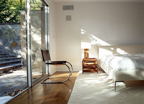
As you might expect from a Polo Ralph Lauren alumnus, this New York designer’s rooms tend to be masculine, well tailored, and timeless. He likes his palette neutral, but the Florida-born designer isn’t afraid of shades like light blue and royal purple either. He mixes crisply upholstered custom-made pieces, American antiques, and accessories ranging from Coromandel screens to rough-hewn doors set into pristine white walls, all resulting in a quietly invigorating look.

Here are some pictures.


I can't believe I'm saying this - but his work really speaks to me. Or - since that sounds a bit dramatic - I was really drawn in while going through his portfolio. I find his designs kind of fascinating. They're generally contemporary - but never have a spare or cold effect. They're actually very warm and inviting - and even offer some surprises and personality.

But let me backtrack a little. At first glance, this is not a designer that I would expect to appreciate as much as I did. He incorporates very little color in these spaces, which is one of the first things that I consider while getting the feel of a room. He also uses a lot of contemporary furniture, and antiques and older pieces are often of such similar style, that they don't provide very much contrast. I on the other hand, prefer a more eclectic approach to decor - with rooms that look like they have evolved over time. Finally, there is very little focus on art (or the wall decor is so subtle or unmemorable that I didn't really register its presence). And the art that does appear in these images looks more like it was placed there to compliment furnishings after the design was completed. Nothing is wrong with any of that, but none of it falls in line with my own preferences.

Regardless of my personal taste, these are pretty great rooms and I can't imagine many would disagree. Somehow, he manages to give very specific styles universal appeal. And one obvious reason is that he is a master stylist. His resume really shows in his work.

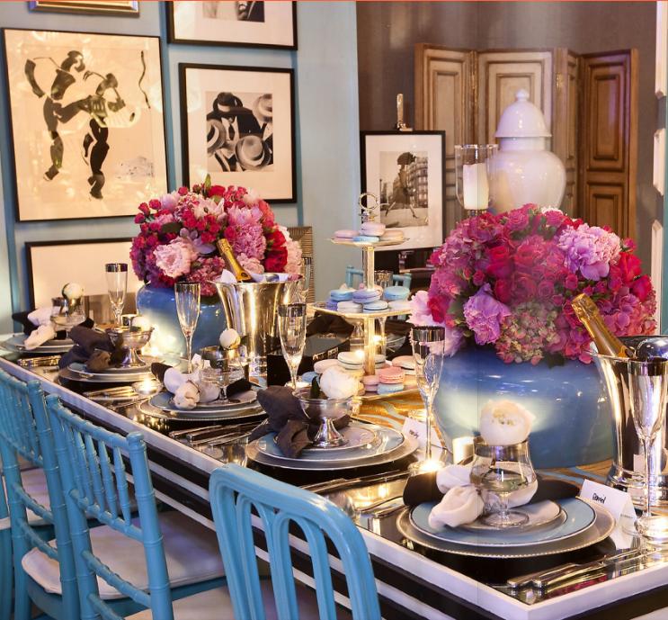
When you click through his online portfolio, the one consistent theme is impeccable, yet seemingly effortless styling. The last six images display this best. Probably because some of them were shot for ad campaigns...but they really do encapsulate the elements of styling that he brings to interiors.

It's the styling that takes what could have been pretty boring, masculine rooms and softens them. He can even "do" feminine...and well (see images 4, 8 and 9). I honestly think he could take any half-hearted bachelor pad with good furniture, rearrange things, add some accessories, pop a few lilies in an organic looking bowl, possibly slap a little textured paint on the wall...and voila! it's a spread in Elle Decor!

How about that last image? Is that a photograph or a painting? Something about the wall, the orchids...even the angles of the furniture and lighting... I can't stop looking at it.

So yeah - this was a surprising one for me. And a perfect example of how looking for what you DO like in all design will open your mind, make you think and possibly compel you to reconsider previously held notions about your own personal style.

What about you? Have any thoughts to add?


all images via Mark Cunningham Inc.

Friday, November 4, 2011

Elle Decor's 2011 A List - Designer #1: BassamFellows

Last year, I thought it would be fun to write about Elle Decor's "A List" of designers. And it really was.

Here is the first image featured in what ended up being months of posts:


Pretty right? I and when I started, I thought it would be all about my preferred "pretty."

Not so much.

So in addition to being fun, this exercise was also somewhat of a learning experience.

I challenged myself to focus only on what I DID like about the designs - and to then write about it. This is counter intuitive to my usual "in or out," "yea or nay" approach to finding beauty in the world.

And I would assume that most could say the same. Do you love every designer's personal aesthetic? I don't. In fact, I often exclaim things like, "that's hideous!" and "why would anyone want to sit in a giant brass hand?"

But in trying to find at least one appealing element in some images that seemed custom tailored to make me gag, I experienced something rather extraordinary. I started finding myself drawn to new designs and ideas that I would have once labeled: "not my style."

And since I've been making a lot of "not my style" statements lately...I think it's time for another round of "what DO I like about this?" And what better place to find designers and perspectives than Elle Decor's 2011 A List?

So without further ado, today's spotlight is on BassamFellows.

Here is what Elle Decor says about them:

Handcrafted, organic, and rooted in nature: Australian architect and designer Craig Bassam and Scott Fellows, a former creative director in fashion, describe their style as “Craftsman modern.” A gorgeous wood grain is often all the ornament they need, whether they are designing spare interiors for the James hotel in Los Angeles or renovating their own Philip Johnson house.

This is already making me feel uncertain. While I can appreciate beautiful wood grains and organic elements, the description very clearly omits any reference to color. These are not going to be colorful spaces, are they? Also? "Spare" is not an adjective that describes most of the interiors that I love... So the challenge begins!

First - some pictures.


There aren't exactly tons of images out there for BassamFellows, and their own site only features one residential project (the rest are office, retail and hotel spaces). So to say that there wasn't a lot to choose from would be an understatement. On the upside, it certainly streamlined my photo selection process.

The first thing that strikes me about all of these spaces is the focus on bringing the outdoors inside. And oddly enough - this is very similar to the Key West culture of outdoor living. No - you won't find many Conch houses with glass walls - but it's not uncommon to see walls of French doors leading out to patios and porches.

I love the way the rooms are filled with light. And I can easily imagine spending a quiet afternoon reading and sipping tea, glancing up to see that I'm surrounded by trees.

While this definitely isn't the decor that I would want in my own house, I would thoroughly enjoy visiting those rooms. And I think that may just be the core of this challenge: being able to appreciate and enjoy spaces that you wouldn't necessarily choose for yourself.

One thing that I'm going to do a little differently this year, is that I am going touch upon elements that don't appeal to me. Just a little bit - and primarily because I would LOVE to hear your thoughts too. Tell me why I'm wrong - or just offer another perspective. Help me broaden my decor horizons.

So here is a bit about what I don't like:

The lack of art. Whenever I visit a home, I love to look at what the owners choose to put up on their walls. It's such a personal element of decor. Not just anyone could live in that house.

And while I have learned over the years that contemporary furniture can be very comfortable...those hard benches and backless stools are probably better for looking than sitting.

Of course, an architect and a furniture designer are bound to be far more conceptual than most when it comes to interiors... So I understand that the structure of the rooms themselves and the pieces of furniture within are an expression of art. Still - it feels a little impersonal to me. A little cold. And honestly, I wonder what those rooms really look like on a random Saturday afternoon.

Thoughts?


1/2/3/4/5/6/7

Wednesday, March 9, 2011

Darling Monkey Chair

We spotted this adorable little chair in Shelter Interior Design's portfolio recently and had to share:


Forget the nursery - we'd put that in the living room. Kids need a place to sit too! Oh - okay, it could be nursery furniture until the kids grew up. Then we could move it to the living room and call it a "family heirloom."

It's not like the chair is actually child size anyway... But THAT would be even better!

Wednesday, February 16, 2011

Anxiously Anticipating Trad Home


From the inaugural issue of Lonny, we've been blown away by the level of creativity, content and straight up brilliance in what appears to be a revolution of online style magazines.

While the features devoted to contemporary and "edgy" decor don't quite fit with our own design aesthetic, they still wow us with their risk taking irreverence, approachability and sly introduction of new concepts, lines and colors based on older, more traditional styles. To a certain extent, this exposure to such different design philosophies has kept us from becoming too set in our ways - it's made us consider new things...

We also still hate a lot of it.

But isn't that what style is all about? Seeking out what works for you and consistently finding inspiration in both expected and unlikely places? To each his own - but pay attention to each other...you might learn something?

Still - as far as the online magazines go, the scale is tipped toward the cutting edge. Not so much that they lose us completely - but enough that we often like "the idea" of a design - or possibly specific elements of it - rather than the design itself.

And this makes us feel frumpy.

And NO ONE likes feeling frumpy.

But a new online magazine scheduled to debut, April 12 on lonnymag.com may just offer a perspective more in line with our own design sensibilities. Lonny founders Michelle Adams and Patrick Cline are teaming up with the publishers of Traditional Home to produce Trad Home, a digital issue of the glossy - one that covers "Young Traditional" spaces.


Per Michelle Adams: "We think this will appeal to the reader of Lonny, but it will be an entirely different product. You could say it will be a more grown-up version."


Much like the more contemporary and "mid-century" leanings of new design that we see so much of online, Traditional Home sometimes loses us with their opposite spectrum of palatial estates, frequently featuring swag window treatments and overstuffed everything. While we relate to much of the content in each of the highly diverse sources, we're often a little on the fence.

Perhaps this new project bringing the two together will be where we find our niche. We're very much looking forward to finding out this Spring!

Sources: Curbed, Habitually Chic, Media Bistro, Simplified Bee and So Haute

Images: Bonesteel Trout Hall, Jamie Herzlinger, Megan Yager Design, and Sarah Gilbane Interiors

Thursday, February 10, 2011

When Strange Things Happen to Normal Rooms

Recently a space was featured on The Decorista that made me think.

I know! These are the things that keep me up at night...

Anyway she was charmed by this home because of its quirky personality and use of color. Two decor perspectives that we wholeheartedly embrace.

Whether it's to our liking or not, we can't dispute the quality of a well thought out space that expresses the owner's unique style. This image displays a fun, youthful and somewhat irreverent arrangement that works.


But while I find THIS image just as aesthetically pleasing (if not more so) for its use of color and textiles, it simultaneously perplexes me:


At first glance, it's fine. But upon closer inspection, there are two elements that are kind of bizarre. First - the low chairs that are paired with that table.

They're like beach chairs and convey a sense of casual comfort. But what happens when you decide to take a seat? Do you have a beverage in hand? Where do you put it in between sips? On the table which now offers a surface area at eye level? I'd probably just use the floor. So why bother with the table?

Well the answer to that seems obvious. It's less of a table than a pedestal employed to display a large ceramic zebra.

That zebra has been haunting my dreams.

In all fairness, the table also features a lamp and what appears to be a stack of decorative books. But the zebra is the real star of this stage. The proportions are just wacky.

I'm all for fun accessories and art. But when it comes to ceramic wildlife, a good rule of thumb is to keep the percentage of surface area used at less than a quarter. Otherwise, the animal takes on a somewhat larger than life quality. And you never want an accessory to look like it could leap off a table and canter down the hallway.

So as appealing as this cozy corner may initially appear, it has some serious problems when it comes to functionality.

Sometimes designers can get so caught up in concepts and whimsy that they forget about the people using the space and their potential preference for not looking up a ceramic zebra's nostrils while retrieving a cocktail positioned somewhere behind their left ear.

A cautionary tale indeed.


Thursday, February 3, 2011

High Gloss Color

We're really enjoying High Gloss Magazine and have added it to our list of online must reads.

Here are some of our favorite images (with color of course!):


Vibrant or subtle...the warmth that these color stories generate translates into a feeling of "home." An often forgotten interior design priority. But one that we greatly value.

In general, the magazine offers a great mix of styles and aesthetics and the amount of copy to read (articles, interviews, etc.) is dense. An impressive inaugural effort. We'll eagerly anticipate issue 2...

Tuesday, February 1, 2011

Blue Magic

The blue palette that Tobi Fairley used in her March 2010 House Beautiful cover feature was universally sigh-worthy. Whether you prefer traditional or contemporary style, the layout, furniture and color choices would provide a beautiful starting point for almost anyone's personal touch.


And just last week on her blog, Tobi shared a slew of pictures that show an astonishing transformation. If the HB cover didn't blow you away, the before and after images will:


The styling of the magazine cover softened up the couch with throw pillows, but we would have preferred something a little less...furry. Either way - it's stunning.

Here are more that we loved:


What we didn't love? The dining room:


This puts us in the minority of course, as there has been much praise for the two things that perplex us. First? That totally superfluous cushioned bench. Exactly who is going to be sitting there? It's about as useful as a bathroom reading nook. It may look nice, but unless you are throwing a big party with people filling every room, we just don't see the need for additional seating. The space would have been better used for display purposes. She could have done something just as fabulous with some built in shelves, art and sideboard space.

The other feature that makes us cringe is that chandelier. While on trend at the moment, it will look ludicrous in ten years. Maybe less. If you really love something and it speaks to your personal sense of style, then trend transience shouldn't deter you from your choice. BUT our guess is that the person who owns this house will be ripping out that lighting fixture the minute it starts to look dated.

The other space that really didn't grab us is the shiny master bedroom:


It's just a little too icy. And shiny. And austere. And shiny.

The mirror above the bed AND the mirrored side tables are a bit much, but paired with that sleazy poly-blend looking (probably outrageously expensive) bedspread, it's just a little too cold for a bedroom. Perhaps a furry pillow would have softened things up a bit?

Personal differences of opinion aside, we love the colors, textiles, window treatments, accessories...there was just so much to admire. All in all, the decor shows how you can take traditional style and modernize it. That you really don't have to sacrifice comfort and that you can make "pretty" look sophisticated.

See the full story HERE.
Related Posts with Thumbnails